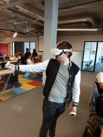
Plastic waste is one of the most pressing environmental concerns we confront today, posing a threat to marine life, our ecosystem, and even our health. Every year 8 to 10 million metric tons of microplastics enter the ocean; from there, these microplastics then enter the food chain, ultimately landing in the food we consume.
In efforts to raise awareness and donations around plastic waste, the #TeamSeas global initiative was founded to mobilise online creators and supporters to remove millions of pounds of plastic from the world's oceans through fundraising and partnerships with environmental organisations. #TeamSeas initially began with significant momentum, but over time gradually lost traction.
In efforts to raise awareness and donations around plastic waste, the #TeamSeas global initiative was founded to mobilise online creators and supporters to remove millions of pounds of plastic from the world's oceans through fundraising and partnerships with environmental organisations. #TeamSeas initially began with significant momentum, but over time gradually lost traction.
THE CHALLENGE:
Help #TeamSeas find a creative and engaging way to rekindle awareness and donations for ocean cleanup efforts.
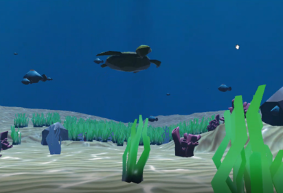
A new Virtual Reality (VR) Experience, in which players are put in the ocean, surrounded by marine life and plastic waste, providing them with the virtual means to clean up the ocean.
Our goal is to raise awareness between the volume of the plastic and the potential donation amount, allowing them a better understanding of their impact through contributions.
Our goal is to raise awareness between the volume of the plastic and the potential donation amount, allowing them a better understanding of their impact through contributions.
MY ROLE:
As Lead Designer I took on a range of responsibilities, spanning from UX, Game Design as well as User Testing. I also assumed the roles of both Project Manager and Team Lead, driving our goals in the right direction. I also dabbled a little bit into 3D Modelling and Texturing for our sea life assets.
STEP 1 - THINK
Analysis
Our first step was to identify the target audience of the #TeamSeas initiative, as well as analysing the different Social Media strategies that led to the campaigns success.
Firstly, the widespread success of #TeamSeas was primarily due to its wide audience reach. Mr.Beast’s channel alone has accumulated over 100 million views and 175,000 comments, while Mark Rober’s video has garnered 45 million views and 42,000 comments.
Secondly, what makes TeamSeas so memorable is their “Every $1 donated is one less pound of trash in the ocean!” slogan, it was catchy and served as a good starter point for us. The main way to donate money was through their website, in which people from all around the globe can contribute funds and leave a small message behind.
Donations from teamseas.org
We also discovered that the #TeamSeas Initiative’s target group was mainly linked to MrBeast and Mark Rober’s demographic of 10 to 18-year-old main channel viewers.
From our own survey most of the #Teamseas target audience, more than half knew about the Team Seas Initiative from the content creators.
In our survey, we discovered that user’s engagement with the campaign has waned, partly due to the
‘Hype being over’, financial constraints or not living near any ocean or rivers for clean-up events. To add, half of the respondents acknowledged being aware of the severe ocean pollution but added that the campaign provided them with a deeper understanding of the gravity of the situation.
‘Hype being over’, financial constraints or not living near any ocean or rivers for clean-up events. To add, half of the respondents acknowledged being aware of the severe ocean pollution but added that the campaign provided them with a deeper understanding of the gravity of the situation.
Conceptualize
For our game concept, we mainly wanted to highlight the core activities of #TeamSeas, which was cleaning up waste and crowd donations. Plus, as a team we wanted to experiment with an unfamiliar technology, Virtual Reality, to discover how it could spotlight these core activities. To start with, we mainly took inspiration from the paper toss games as well as other game concepts of how tools in VR could be used.
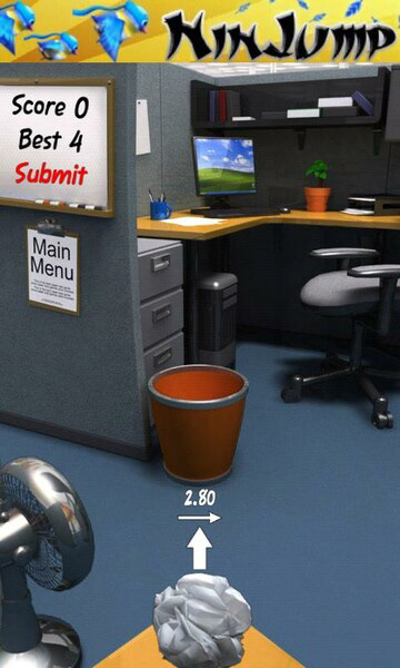
Paper toss game, 2009
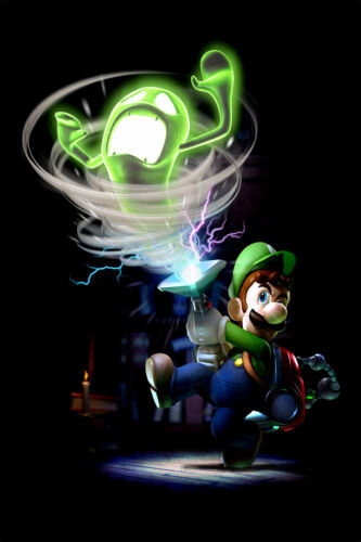
Nintendo, Luigi’s Mansion
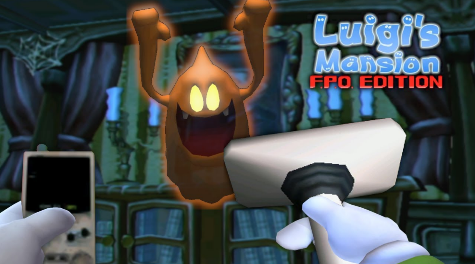
Sky Blue Luigi, Luigi’s Mansion FPO Edition
To fully maximise the immersive potential of the 360-degree experience, we determined that users would collect waste objects from their surroundings - whether above, behind, or around them.
For this concept, we purposefully kept the user stationary in order to reduce the potential risks of motion sickness. The final concept combined elements from the classic paper toss game with an underwater experience, allowing players to pull trash items towards them. Users need to aim and shoot each collected trash item into recycling containers.
For this concept, we purposefully kept the user stationary in order to reduce the potential risks of motion sickness. The final concept combined elements from the classic paper toss game with an underwater experience, allowing players to pull trash items towards them. Users need to aim and shoot each collected trash item into recycling containers.
Concept Sketch
To round it up, the donations contributed by #teamseas supporters will serve as the player’s goal in the experience. Initially thought of as a donation on a simple website, we reimagined it into an interactive Live-Stream Pop Up donation, which not only includes both the donation amount but also a personalised message.
Donation on teamseas.org
The Objective In the Experience
STEP 2 - BUILD
First and foremost, as we are dealing with a VR experience it is critical for us to keep the experience as smooth as possible, as high latency, especially for VR experiences, can make or break an experience.
For that, we took notice of various VR Games’ rather simple art styles opting for game performance.
To achieve the same effect, we explored the possibility of creating a low-poly, more stylized experience to enhance fluency and optimization. On the engineering side, we looked into ways to reuse game assets wherever possible for optimal smoothness.
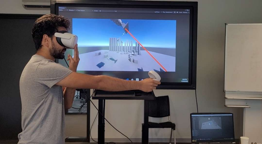
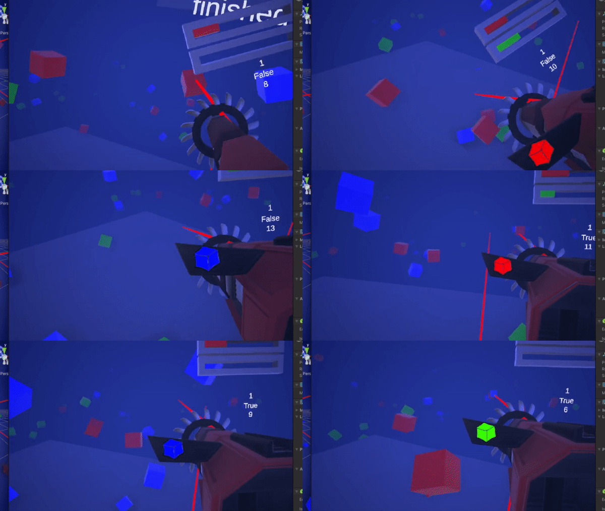
In order to test our idea for its viability, we focused on working out the core absorbing and shooting mechanic of the Vacuum.
Once the core mechanic was more fleshed out it was time to test it with users. Throughout the project duration, we took note of multiple user feedback and considered them when building out our VR experience:
Dynamic Environment
After some initial testing, testers suggested giving the player more emotional engagement with the environment. For example, they proposed adding sea life within the experience and the impact waste pollution can have on the environment.
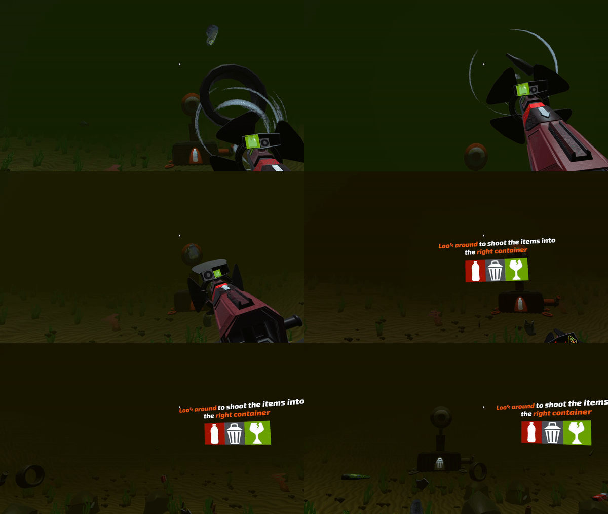
With that feedback in mind, we rethought the environment to change dynamically based on the user’s progress; The more waste surrounding the user, the more polluted and foggy the environment will seem. On the contrary, if the user collects and sorts out waste the right way, the cleaner and clearer the environment will be.
With that feedback in mind, we rethought the environment to change dynamically based on the user’s progress; The more waste surrounding the user, the more polluted and foggy the environment will seem. On the contrary, if the user collects and sorts out waste the right way, the cleaner and clearer the environment will be.
Sea Turtle Companion
We also introduced the idea of having a sea animal appearing and disappearing at specific times, which the player has to protect from getting entangled in the waste objects. However, after testing the concept, some testers suggested that the turtle stays in the environment throughout the whole game session.
We also introduced the idea of having a sea animal appearing and disappearing at specific times, which the player has to protect from getting entangled in the waste objects. However, after testing the concept, some testers suggested that the turtle stays in the environment throughout the whole game session.
Smoother Shooting
When we were testing the shooting mechanic, we noticed players pausing before shooting the next item, as they were only able to see the current waste item they were holding on to. To ensure feedforward shooting, we added a second smaller screen displaying the next object in line for shooting.
When we were testing the shooting mechanic, we noticed players pausing before shooting the next item, as they were only able to see the current waste item they were holding on to. To ensure feedforward shooting, we added a second smaller screen displaying the next object in line for shooting.
Relocating UI
Many players seemed confused about which items they had collected and which ones they were shooting. It turns out that the screen that showcased the items was out of their vision.
Many players seemed confused about which items they had collected and which ones they were shooting. It turns out that the screen that showcased the items was out of their vision.
As a resolution we moved the screen that contained the necessary information.
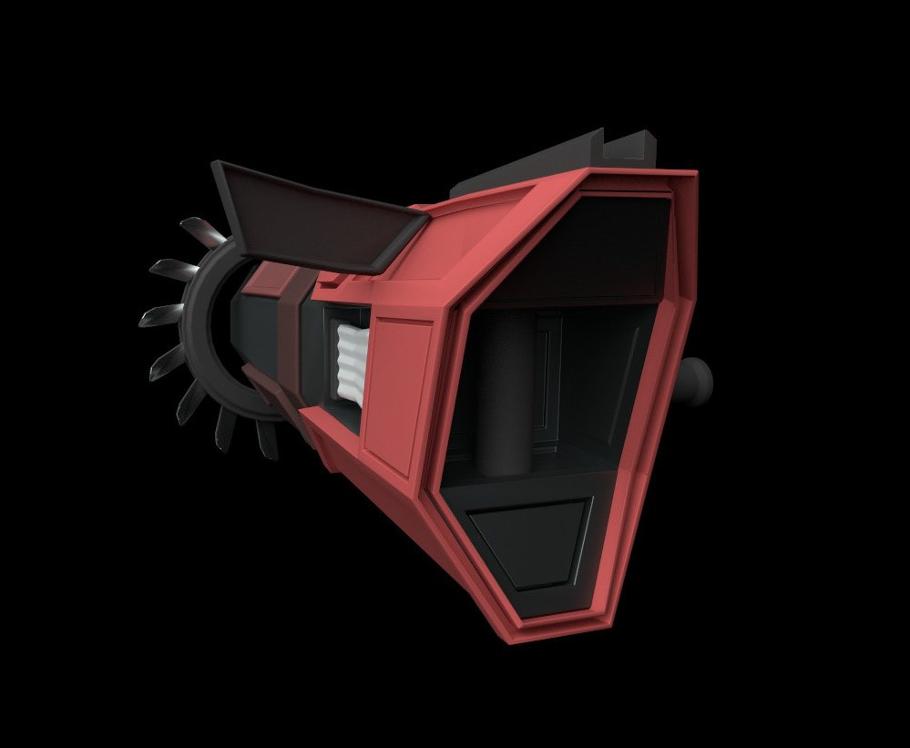
initial Screen Location
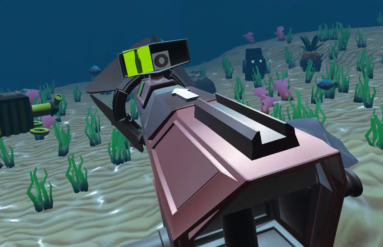
Relocated Screen
Visual indications for different states
Throughout our testing, players also seem to get confused about whether they are currently in the 'shooting' state or the 'collecting' state.
To mitigate the confusion we included more visual hints for the player to know which mode they are currently in.
Throughout our testing, players also seem to get confused about whether they are currently in the 'shooting' state or the 'collecting' state.
To mitigate the confusion we included more visual hints for the player to know which mode they are currently in.
Responsive Feedback
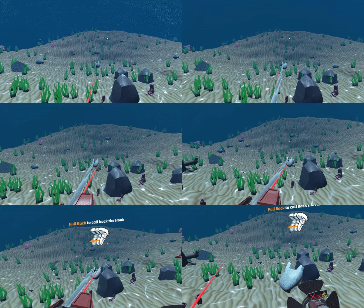
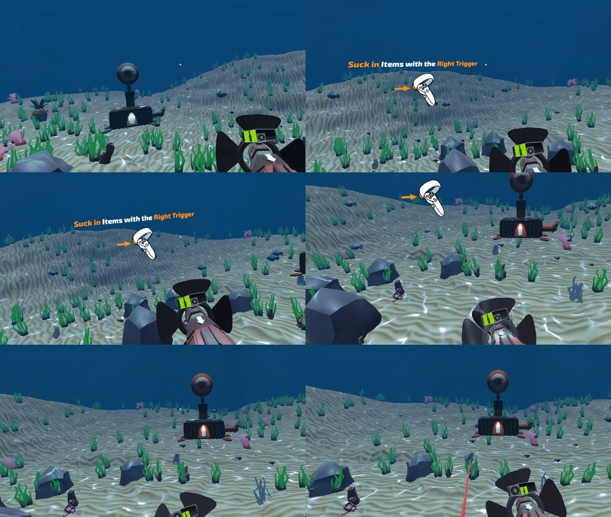
Many players faced difficulties with understanding the controls. In response, we introduced a tutorial at the start of the game to ensure a smoother learning curve. We have also implemented pop-up notifications in case players struggled to perform efficiently, offering guidance and enhancing the overall user experience.
Many players faced difficulties with understanding the controls. In response, we introduced a tutorial at the start of the game to ensure a smoother learning curve. We have also implemented pop-up notifications in case players struggled to perform efficiently, offering guidance and enhancing the overall user experience.
Designing Spatial Objects
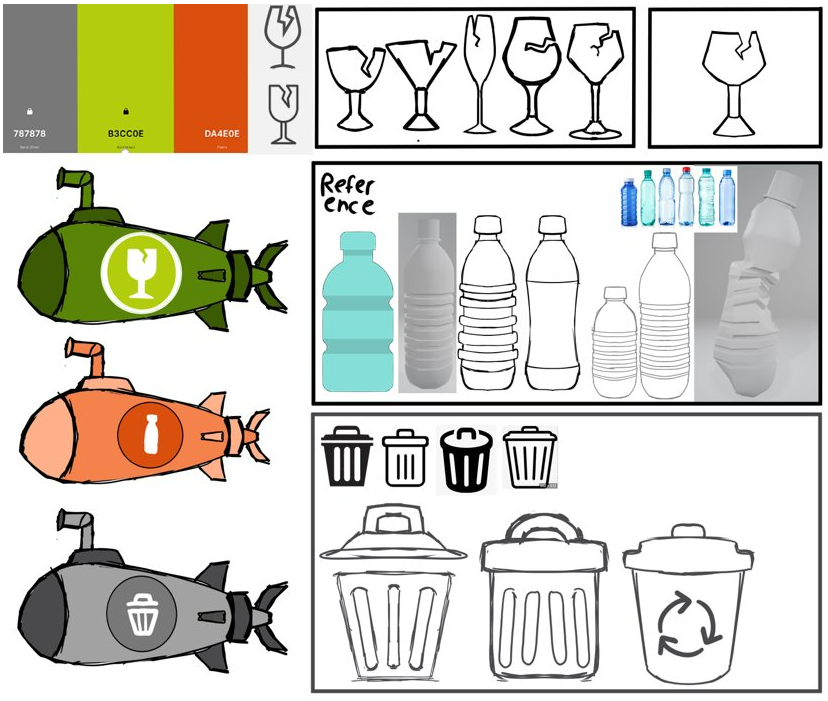
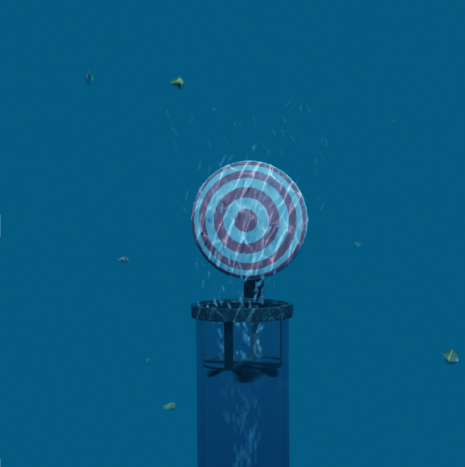
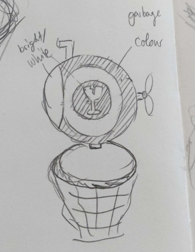
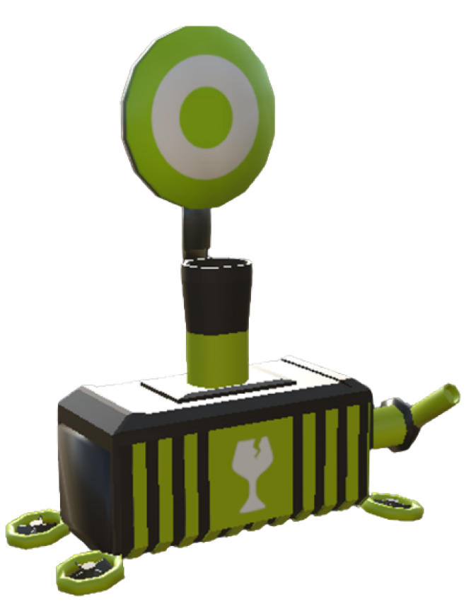
As we looked into ways to make the recycling containers more “shootable”, we iterated and figured out ways to make underwater containers visually clear and understandable.
Starting out as a submarine, through various iterations our team eventually ended up with colour-coded containers with a shootable target.
First Concept
Second Concept
Third Concept
Final Concept
Different Player Views
During our development phase, we noticed that presenting information through VR works differently than conventional screen-based UI designs. Each individual has a unique face and head structure, which reflects their different game view when wearing the same VR Headpiece. While one player may have no trouble seeing the timer UI, another might encounter difficulties. In order to provide every user with the same experience, we added UI settings for users to fine-tune and optimise their view.
During our development phase, we noticed that presenting information through VR works differently than conventional screen-based UI designs. Each individual has a unique face and head structure, which reflects their different game view when wearing the same VR Headpiece. While one player may have no trouble seeing the timer UI, another might encounter difficulties. In order to provide every user with the same experience, we added UI settings for users to fine-tune and optimise their view.
Different Settings are available for moving the UI on screen
STEP 3 - REFLECT
Working with VR has definitely given me an opportunity to look at UX/UI Design more differently. Instead of swiping, typing, and clicking some simple buttons, we now work with arm motions and rotations. Learning that VR Users simply cannot see out of their playing field, made sure that we had to articulate ourselves very specifically, as we couldn’t simply point out the points of interest.
As we engaged with our testers, it became evident that many perceived this experience as a means to raise awareness of sea clean-up initiatives such as #TeamSeas, and not directly a call to action to raise donation numbers. To better align our goals of increasing donations, there are different avenues we could explore to further this initiative.
As we engaged with our testers, it became evident that many perceived this experience as a means to raise awareness of sea clean-up initiatives such as #TeamSeas, and not directly a call to action to raise donation numbers. To better align our goals of increasing donations, there are different avenues we could explore to further this initiative.
Live Donation to Game Donation
Non-profit live-streaming donations can affect the donation amount in the in-game.
Live streamers who are engaging in the experience not only engage with the audience, but the audience can also engage in altruistic means to support the campaign.
Non-profit live-streaming donations can affect the donation amount in the in-game.
Live streamers who are engaging in the experience not only engage with the audience, but the audience can also engage in altruistic means to support the campaign.


