
Case Study Video:
THE CHALLENGE:
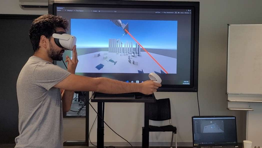
Creating an engaging experience that requires mobile phone Input
THE SOLUTION:
Building a multiplayer mobile to PC Party game, in which players outrun each other and reach the end goal first.
MY ROLE:
As the sole designer of the project, I took on a range of responsibilities, including Level Design in Unity, Controller UX, JavaScript Controller touch, User Testing, UI Creation, Project Management and leading Daily Standups, and lastly Art Asset Implementation.
STEP 1 - THINK
Once we knew the challenge, my team and I explored different ways that we could interact with a mobile phone, such as rotation, tilting, AR or GPS. However, as a team, we wanted to strive into a different direction, which is why we looked into Local Networking as well mobile to PC/ or mobile-to-console experiences.
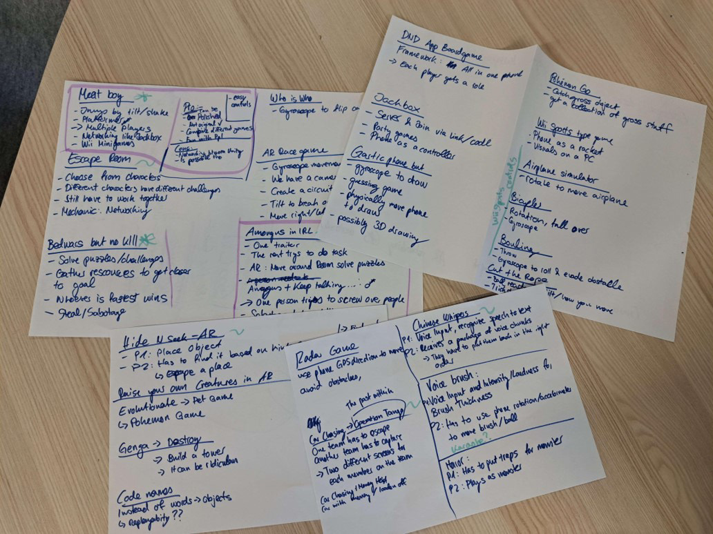
Different Directions and Ideas
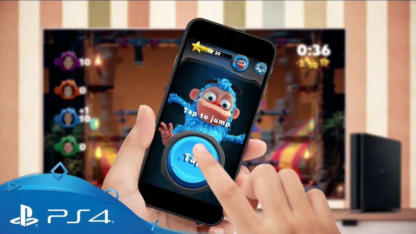
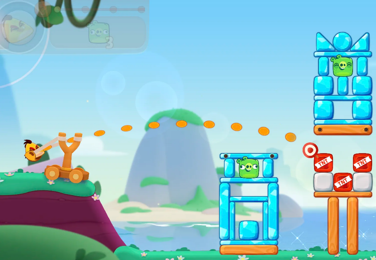
Chimparty by NapNok Games
As we considered multiplayer experiences there were two specific games that inspired the direction we wanted to take ours:
SpeedRunners by TinyBuild
This game's goal is to outrun other players. Those who are falling behind and are out of the screen will not be able to continue.
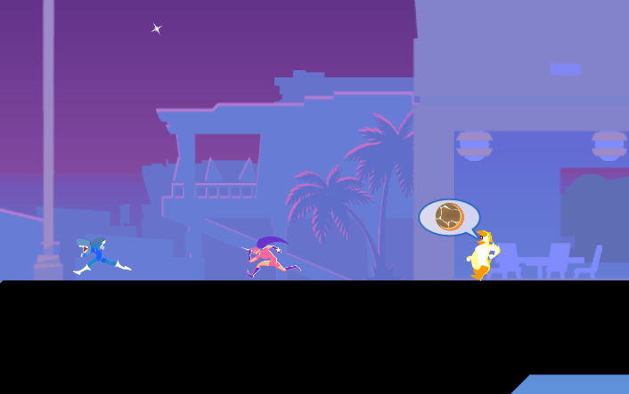
Transformice by Atelier 801
Transformice is a multiplayer platformer, where players have to interact with different physics objects to reach their goals.
Each player can also see how other opponents are interacting and monitor their progress.
Each player can also see how other opponents are interacting and monitor their progress.

We combined the different interesting aspects of each game and figured that we would create an outrun-your-opponents style game, in which players will use their own mobile phone to move their in-game character.
As we ideated one possible problem came into mind, which was how quick and responsive the connection between phone and PC would be. There were two different directions that our game could take:
As we ideated one possible problem came into mind, which was how quick and responsive the connection between phone and PC would be. There were two different directions that our game could take:
Fast Transmission
If the time between phone and PC was quick enough, we would take the experience in a fast-paced direction.
Slow Transmission
If the information transmission between phone to PC was noticeably delayed, we would opt for a slower-paced strategy game, in which players would take turns to move their character.
If the information transmission between phone to PC was noticeably delayed, we would opt for a slower-paced strategy game, in which players would take turns to move their character.
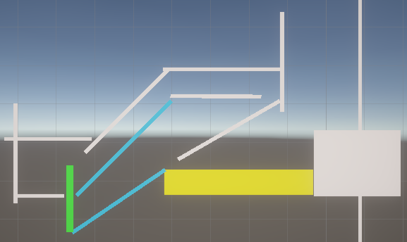
With all of this information in mind, I started to sketch out my ideas and thoughts with paper and pen:
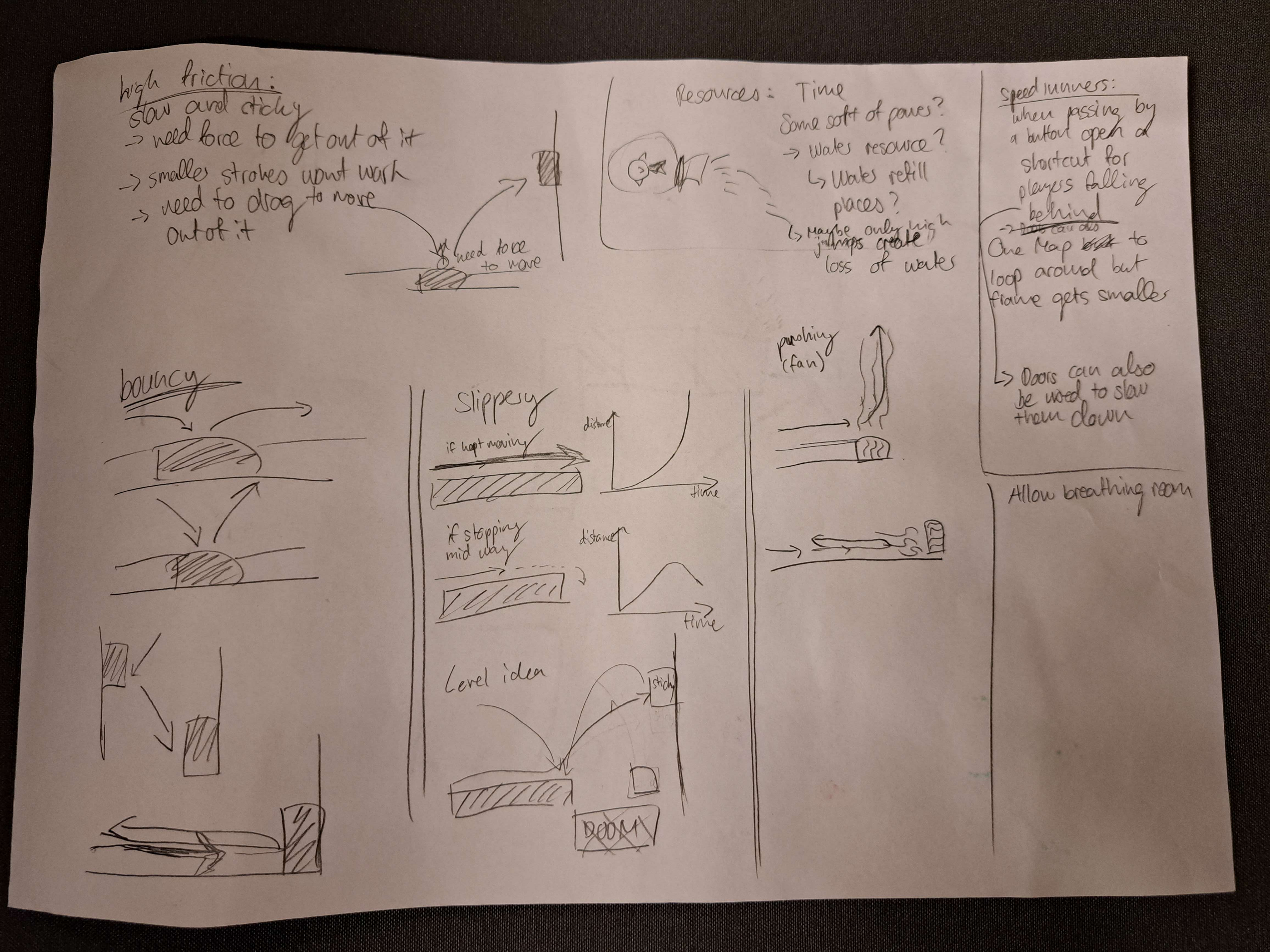
Different Ideas for physic Surfaces
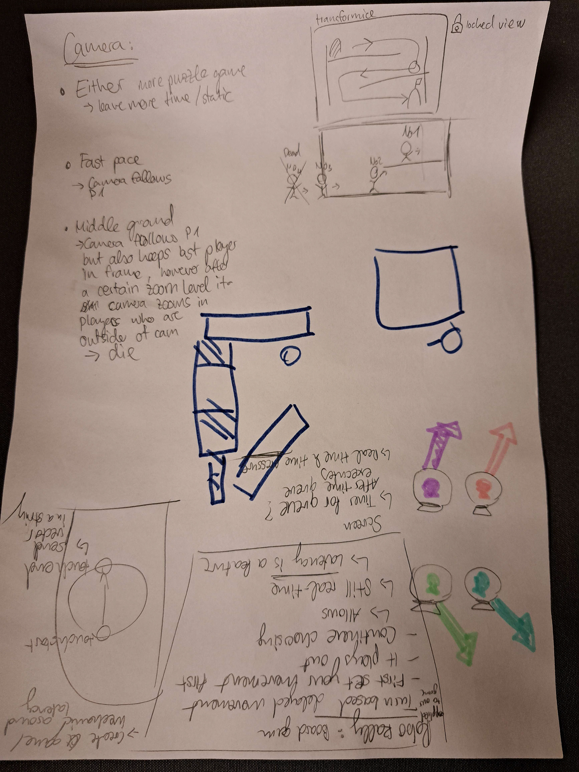
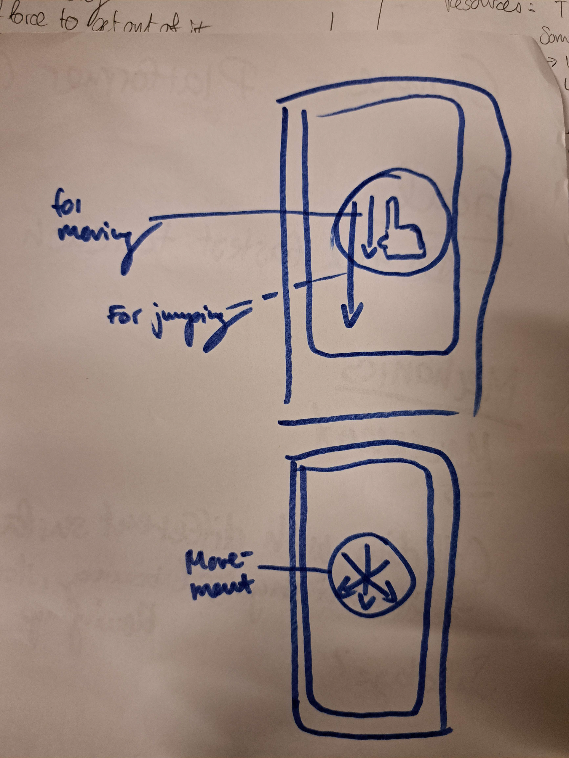
Phone Movement UX
Once we had an outline of the overall game idea, it's time to start building out and test the our concept!
STEP 2 - BUILD
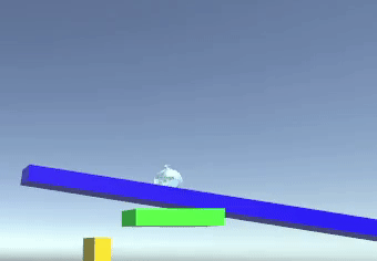
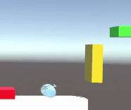
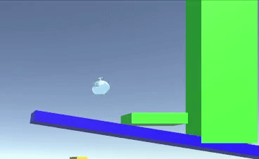
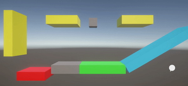
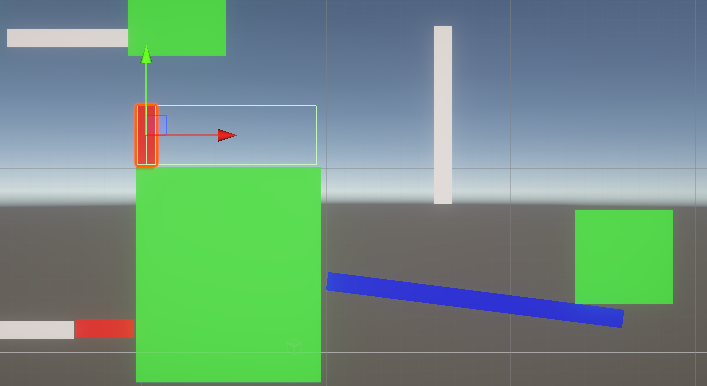
Different Surfaces
While one of two engineers built out the physics surfaces, the other focused on the networking part. I on the other hand looked into mobile touch interactions via JavaScript. Once the surfaces and networking were built out (pushing, bouncing, sticky, slippery), we merged our code so that we could test the controller through local networking.
While one of two engineers built out the physics surfaces, the other focused on the networking part. I on the other hand looked into mobile touch interactions via JavaScript. Once the surfaces and networking were built out (pushing, bouncing, sticky, slippery), we merged our code so that we could test the controller through local networking.
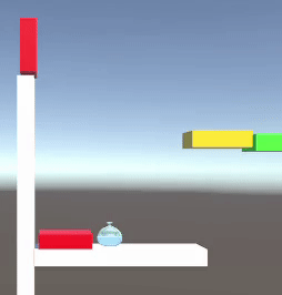
Pushing
Slippery
Sticky
Bouncy
Testing Surfaces in Unity
Surface & Control Testings
During the controller testing, we observed that the transmission from the phone to the PC was fast enough to entertain the idea of a fast-paced multiplayer game.
On the other hand, we overlooked matching the controller UX with that of Unity. Originally, each character's jump was based on the drag length input by the players' mobile phones. The idea was that the longer the drag, the stronger the jump However in Unity the applied strength was consistently the same, so we matched those two to fit the intended game control.
Once the main mechanics had been tested and built, it was time to implement the remaining features for multiplayer testing:
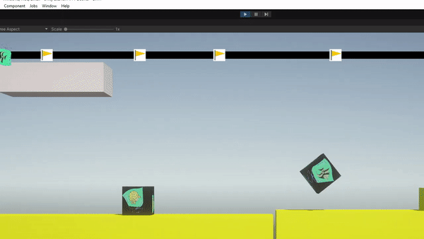
Out-of-Screen Death & Health System
For competitiveness to thrive between players we introduced a dynamic camera system that follows the player furthest ahead in the game. The camera zooms out to accommodate all other players until a predefined threshold has been reached. Beyond this point, players who lag behind and fall out of the screen view are temporarily eliminated from the competition, losing one of maximum three lives.
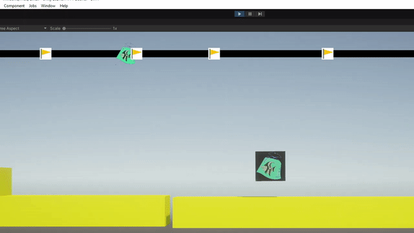
Checkpoints to re-enter the competition
Players who are temporarily out of the competition can
re-enter, provided they have enough lives, once the first player reaches a checkpoint in the level.
We made sure that the eliminated players would only re-enter the competition after a brief delay of the first player reaching a checkpoint. That way eliminated players cannot take advantage of the first player's progress and immediately bypass them.
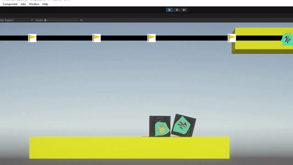
In case everyone is dead
As we thoroughly considered every potential scenario, we implemented a fail-safe to ensure that if all players are eliminated, they will collectively recover from the last reached checkpoint.
As we thoroughly considered every potential scenario, we implemented a fail-safe to ensure that if all players are eliminated, they will collectively recover from the last reached checkpoint.
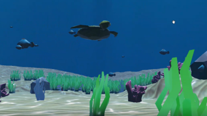
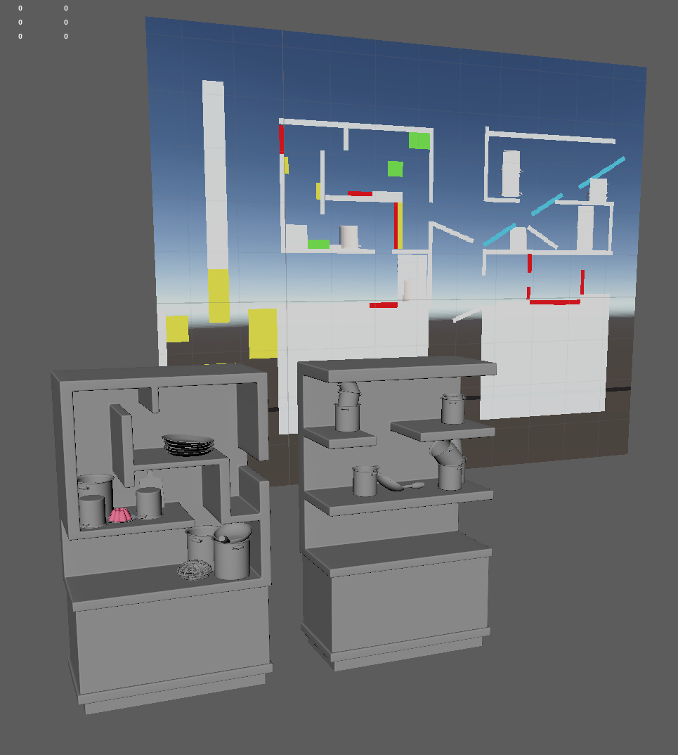
Level Design
Throughout the project, I started building the different level ideas through a low-fidelity prototype, conducting internal tests before I headed out to test the designs with external users. During those observations, I paid close attention to the difficulties users encountered during test sessions, as well as gathering additional insights through their inputs.
Throughout the project, I started building the different level ideas through a low-fidelity prototype, conducting internal tests before I headed out to test the designs with external users. During those observations, I paid close attention to the difficulties users encountered during test sessions, as well as gathering additional insights through their inputs.

First iterations of Level design
Scrapped Design
Scrapped Design
More Finalized Designs
More Finalized Designs
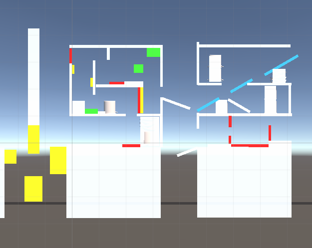
More Finalized Designs
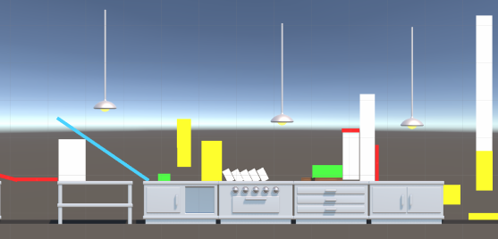
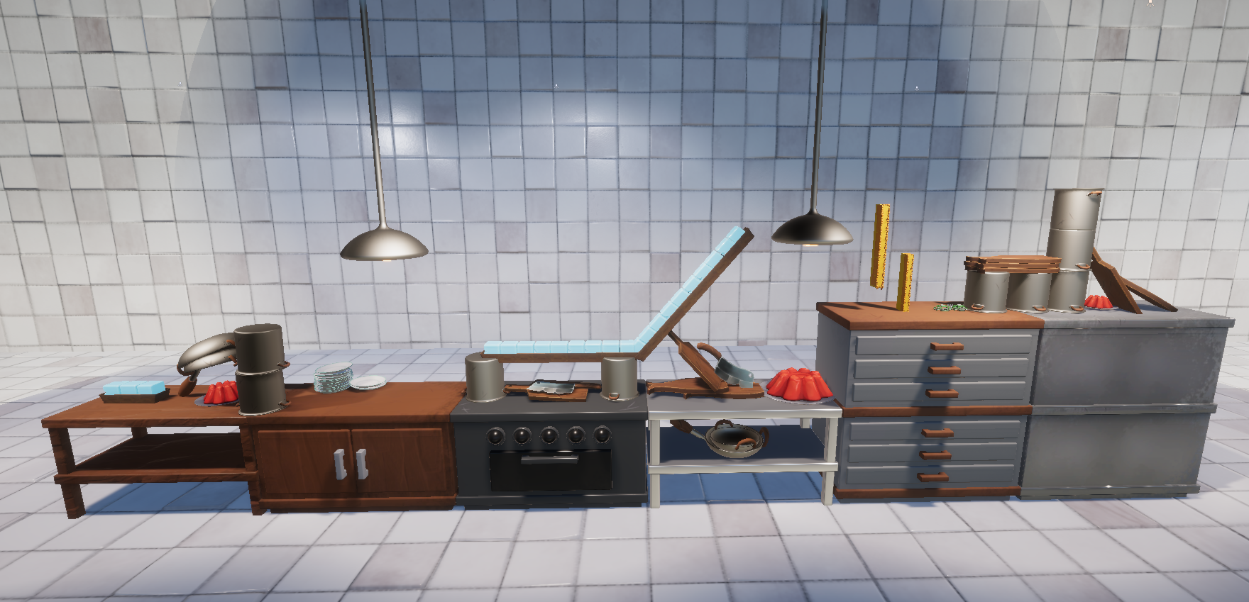
Once the designs had been thoroughly tested we moved on to implementing art assets, polishing the visual feel and look. We deliberately avoided adding collisions to each art asset, as it would affect the game performance. Instead all the collisions have been manually added to match the art assets and intended level design.
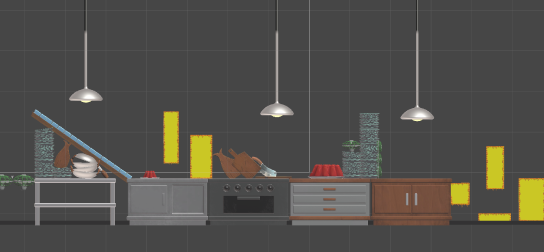
Implementation of art assets
Art design for the shelf level
STEP 3 - TEST
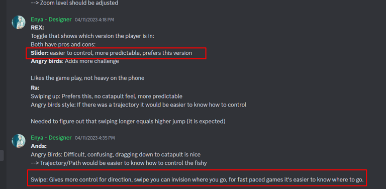
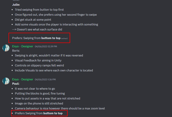
Controller: Catapulting or Swiping?
Throughout the project, we noticed players having difficulty using the controller when we implemented an angry birds-style approach to moving their characters (top-to-bottom swiping approach). For this reason, we wanted to reverse the controls and test if it was more intuitive for users to swipe in the direction of the jump.
We tested both versions with the testers so we have a clear comparison of the controls.
Swiping Top to Bottom, Catapulting
Angry Birds Inspiration
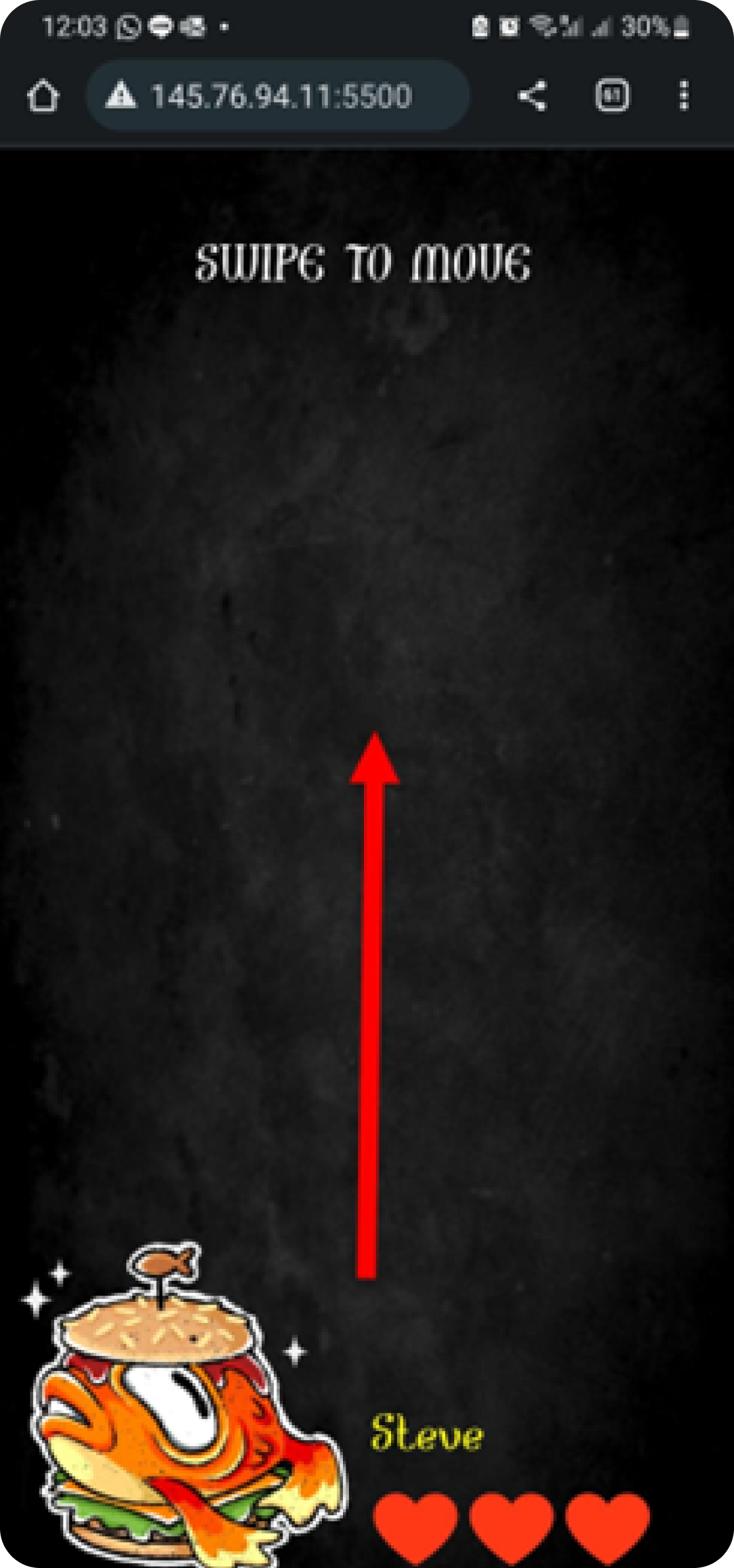
Swiping Bottom to Top, in the direction of the Jump
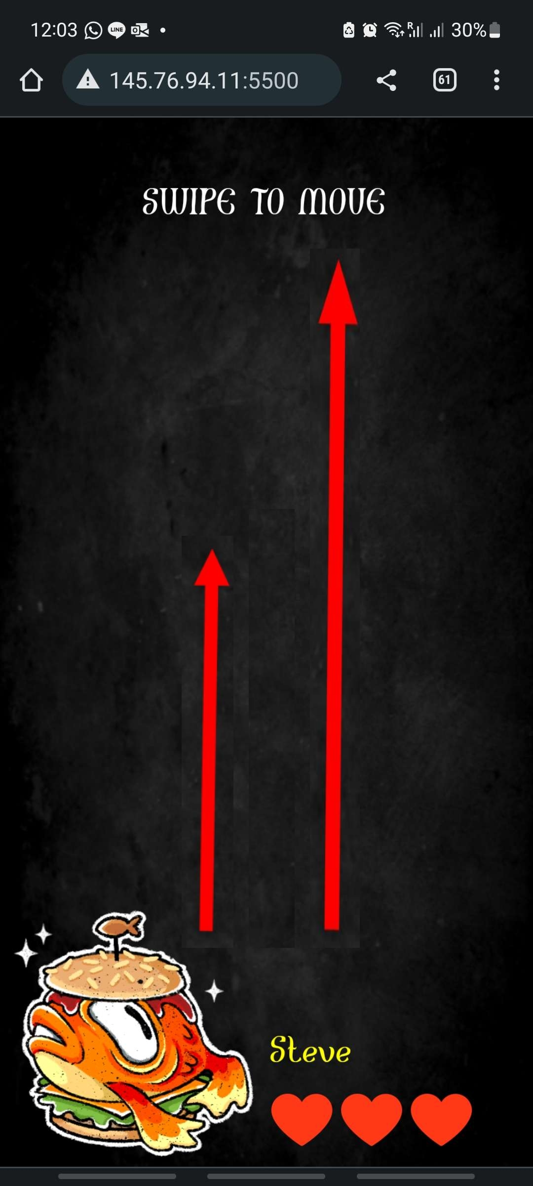
Comparison between halved and initial maximum length
Player Feedback
Player Feedback
The result was most testers preferred the inversed controls, of swiping in the direction of the jump. Since players are constantly trying to outrun each other, a fluid swiping motion seems easier and faster than catapulting controls, which is better suited for strategic and calculated games.
For better control, we also halved the maximum length of the arrow so that players have more precision over their jumps.
For better control, we also halved the maximum length of the arrow so that players have more precision over their jumps.
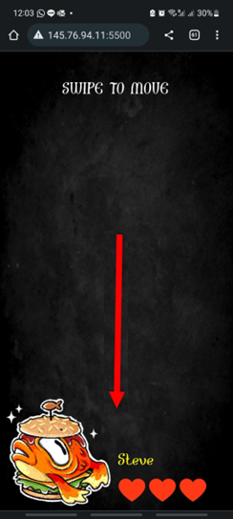
Health and Location Confusion
Another aspect we have uncovered during the tests is how users seem to struggle with knowing their own live count and character location.
Another aspect we have uncovered during the tests is how users seem to struggle with knowing their own live count and character location.
To address this, we introduced a water level system that visually represents the player's life count — higher water levels indicate more remaining lives, while low water levels signify only one life remaining.
In addition, we included a life count UI on both the main screen and mobile phone screens.
To clarify individual player locations, we included Player Tags atop each player, each colour-matched to their respective characters.
In addition, we included a life count UI on both the main screen and mobile phone screens.
To clarify individual player locations, we included Player Tags atop each player, each colour-matched to their respective characters.
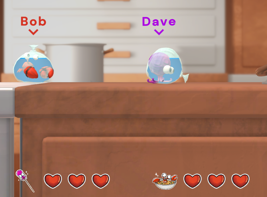
Live Count UI on Play Screen, Player Tag and Color

Live Count UI on individual phone

High Water Level = More Live counts

Low Water level meaning = Only one life count left

Pop up when players lack behind and fall out of screen
Confusion about Player Death or re-entering the competition
Players often experience confusion when they are eliminated or re-entering the competition.
To notify players that they are at risk of elimination, we added a death pop-up, that gradually fills when a player is off-screen.
Once the pop-up is full, the player will be eliminated.
To add, phone vibrations serve as a notification for both player deaths and re-entries, making sure that enough feedback is implemented for these events.
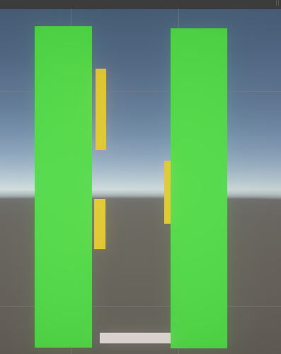
Surface Range not Clear
When testing the different physics surfaces, most testers were confused about the range of the red surface, which adds a pushing force on players. To address this issue, we implemented wind particles that span the full range of the surface, making it more predictable and easier for players to understand

Red Surface in action
no indication of red surface range

Wind particles that go until the end of the range
Tutorial Level Introducing all surfaces and longer jumps

Indication when players have not reached the end of the tutorial
Variations in Player Skill
Due to different player experiences, some grasp the controls with ease, while others find it more challenging.
Individuals who have an easier time progress further, leave behind those who are still learning the controls and the different physics surfaces.
Due to different player experiences, some grasp the controls with ease, while others find it more challenging.
Individuals who have an easier time progress further, leave behind those who are still learning the controls and the different physics surfaces.
To minimise the skill gap, we added a tutorial level that all players must complete before proceeding to the actual level.
This tutorial familiarises players with different surfaces and emphasises that longer phone touch drags result in longer jumps.
This tutorial familiarises players with different surfaces and emphasises that longer phone touch drags result in longer jumps.
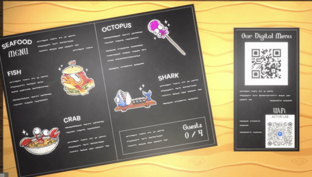
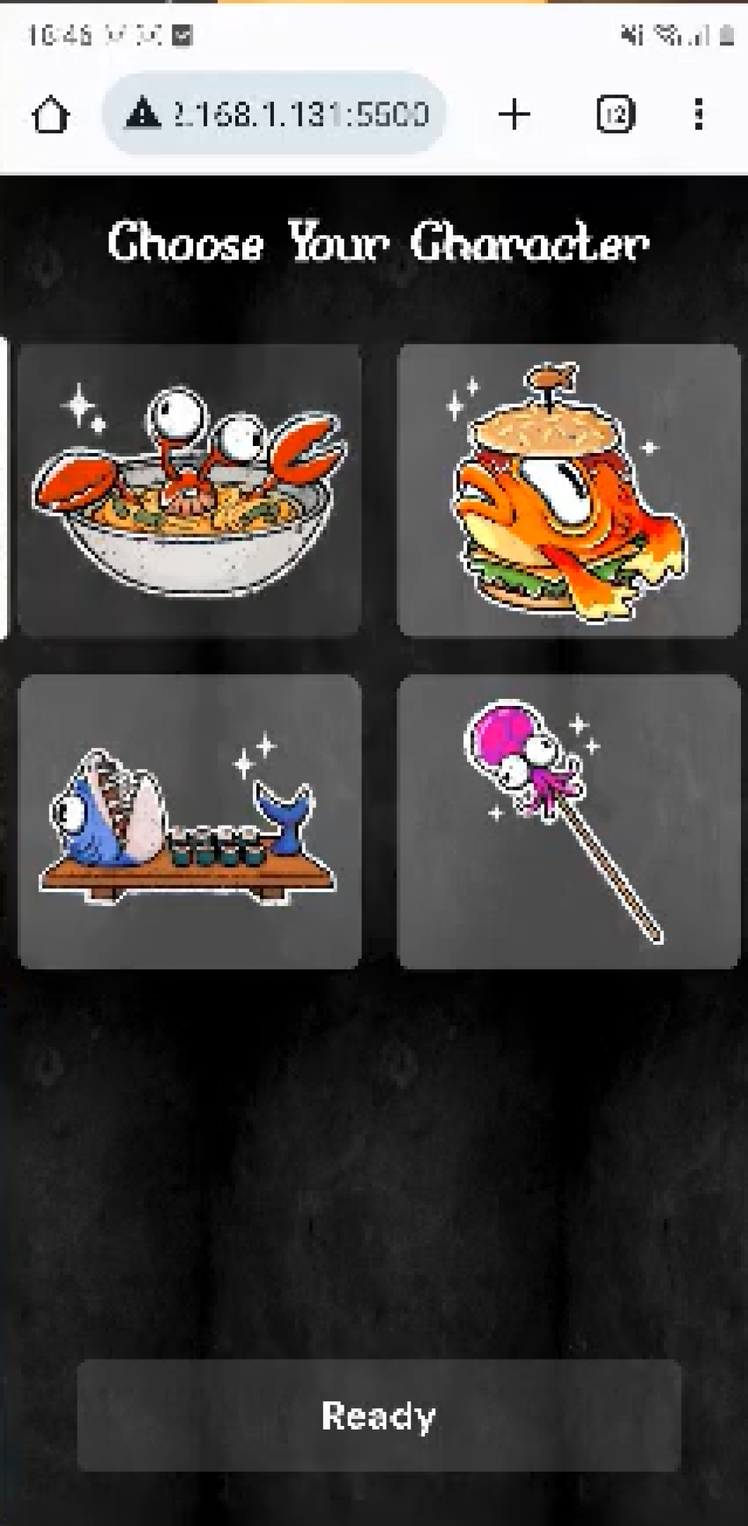
Menu UX/UI for easier entry into the game
On the selection screen, we included a dynamic QR Code, to streamline the entry process, avoiding the need for players to manually enter the IP Address. For more convenience, we also included the QR Code for the Local WiFi for players, sparing users the effort of typing in the local network password.
To make the (restaurant) menu more interesting, we reimagined the player selection screen as an A-la-Carte Menu, in which each player can choose their favourite dish to play!
To make the (restaurant) menu more interesting, we reimagined the player selection screen as an A-la-Carte Menu, in which each player can choose their favourite dish to play!

Menu Start
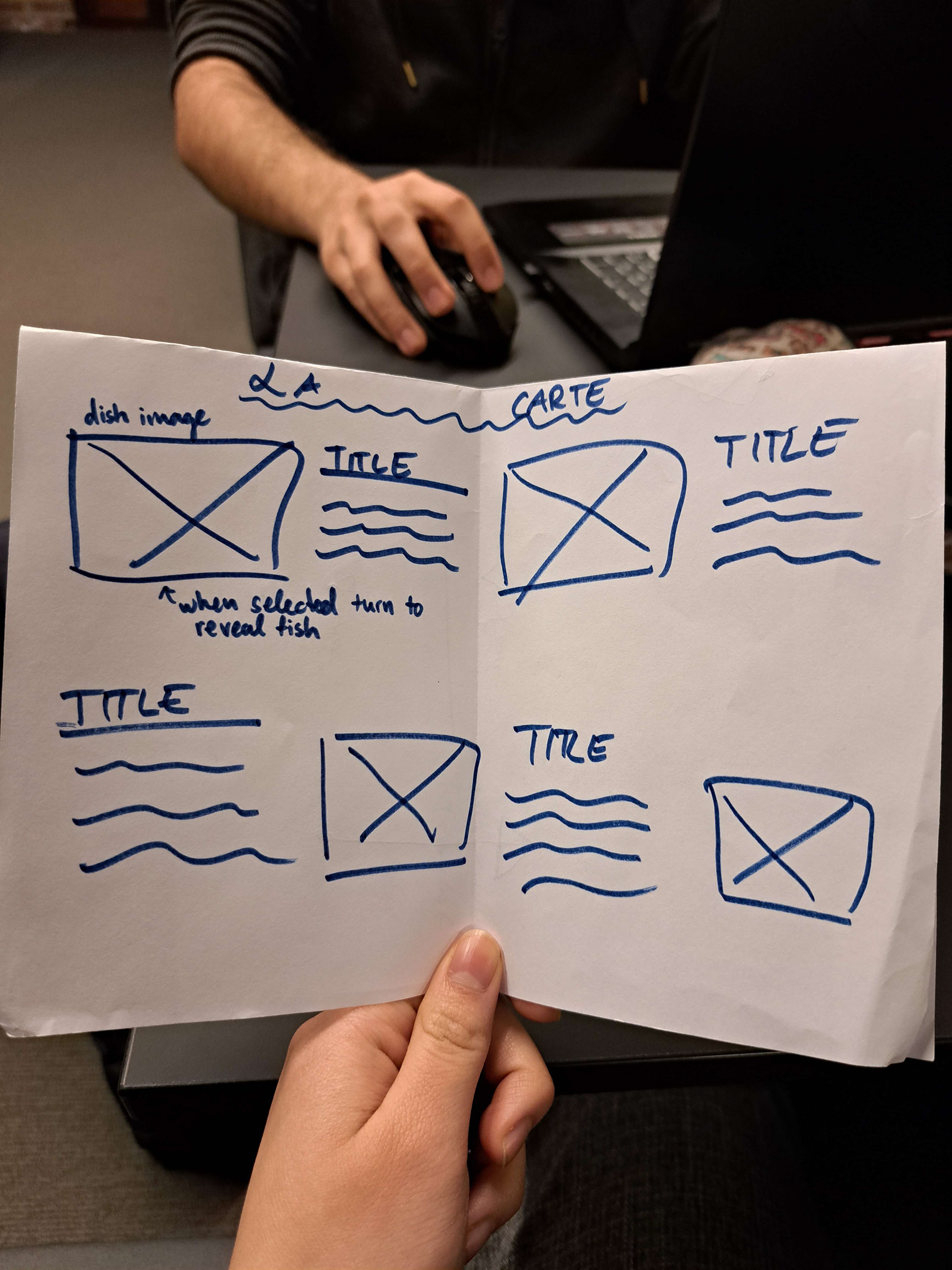
First sketch of the Menu
Menu with characters to choose from, QR Code for game entry and QR code for WiFi Connection
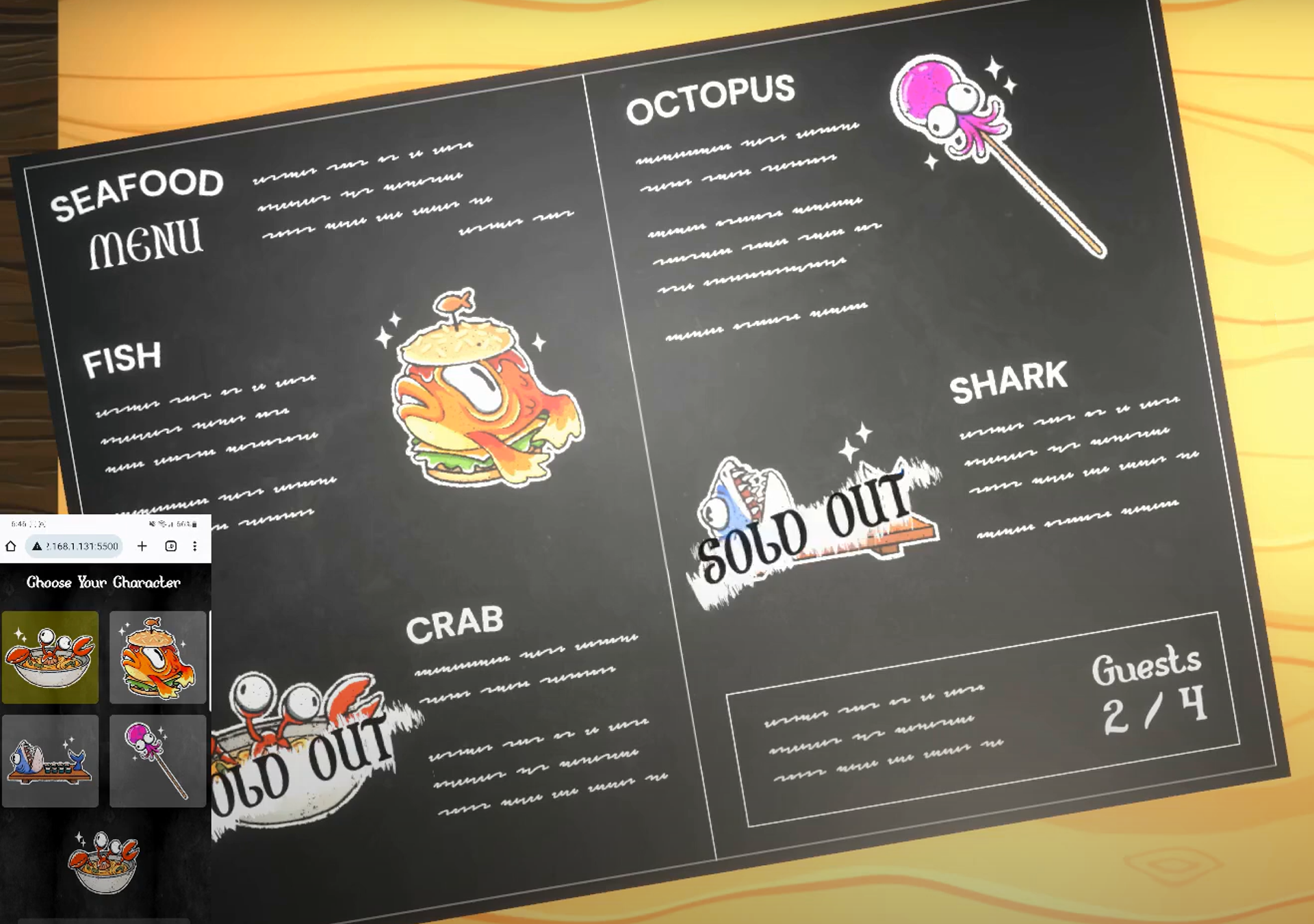
Sold out indication for already chosen characters
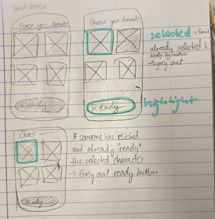
Sketch for Mobile Phone UX
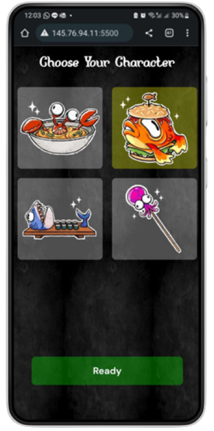
Mobile Phone Implementation
Greyed out option, when character is taken
STEP 4 - IMPACT
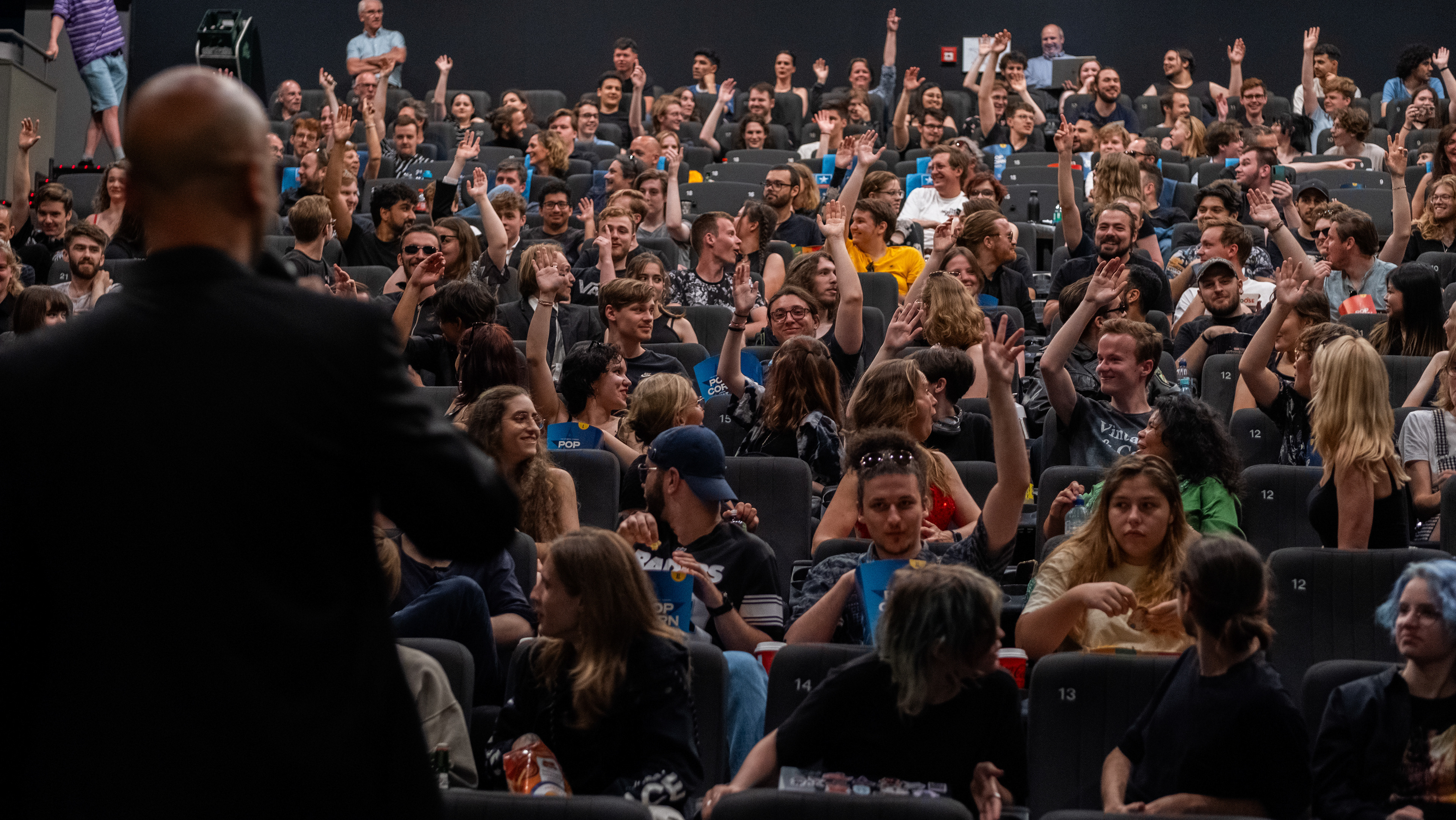
The game's impact has been notable, creating high engagement among the players who found themselves immersed in the competitive nature of the multiplayer game.
It was always a joy to see the players showing their competitiveness against each other, sparking a lively and overall enjoyable dynamic among the participants.
It was always a joy to see the players showing their competitiveness against each other, sparking a lively and overall enjoyable dynamic among the participants.
Full Walkthrough of the Game